
Barcodes and labels might seem like a small detail in the grand scheme of things, but they play an essential role in the entire supply chain management. Barcodes and labels are one of the first things that customers notice when they come across your product.
Therefore, it is extremely important to ensure that the product labels are attractive and eye-catching while being informative simultaneously.
But designing such attractive and eye-catching labels is a challenging task. Many factors, like label size, label placement, font colour, size and style, text clarity, etc., need to be considered while designing labels and barcodes.
So, to help you in this label creation process, we have compiled a list of some best practices for barcode and label designing. These tips will ensure that your product labels are the perfect blend of style and functionality.
At Triton we offer the leading barcode designing package called BarTender Software by Seagull Scientific. BarTender allows you to design the perfect labels by following these best practices.
So, what are you waiting for? Put on your learner hat, and let’s get started.
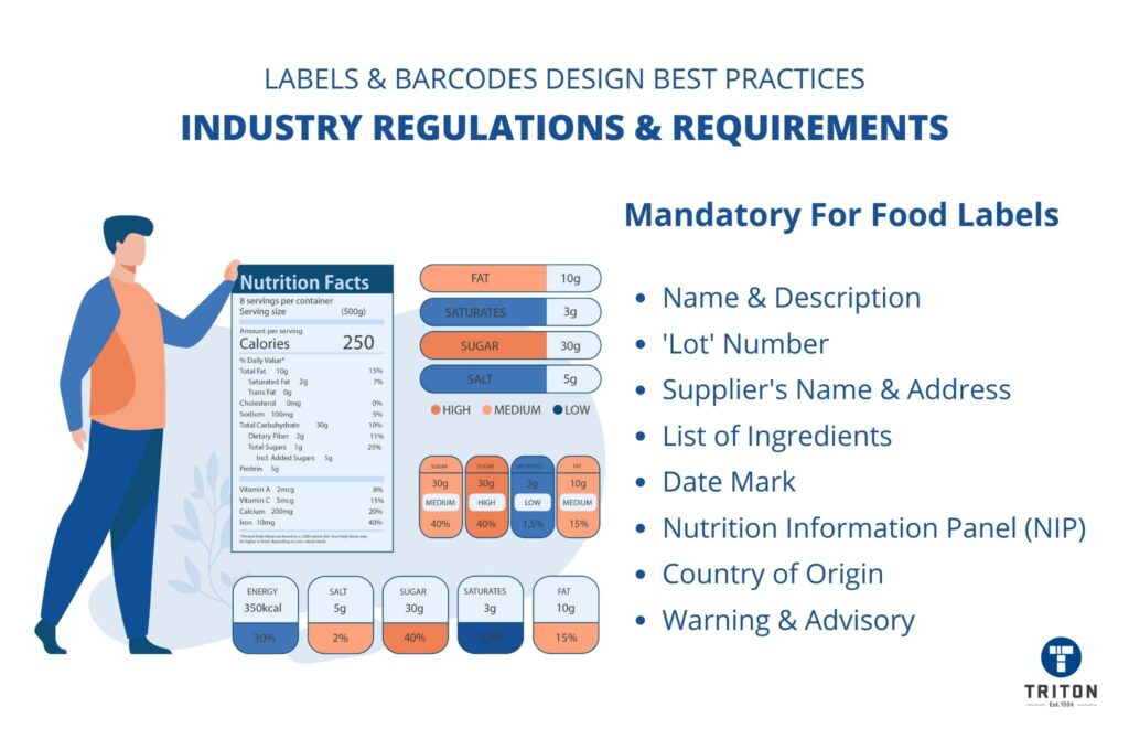
The first and most crucial step before starting a label and barcode design is to check the regulations and requirements of the particular industry or market.
Different industries have different labelling standards and requirements that must be adhered to when designing labels. These standards and requirements will provide a clear idea of what information should be included on the labels and how it should be presented. This, in turn, will help decide on things such as label size, label placement, barcode type, colour, font style, etc.
For example, FSANZ (Food Standards Australia New Zealand), an Australian and New Zealand organisation that sets the food standards, mandates that all food labels must have the following information.
Check out our barcode 101 guide to learn more about barcodes.
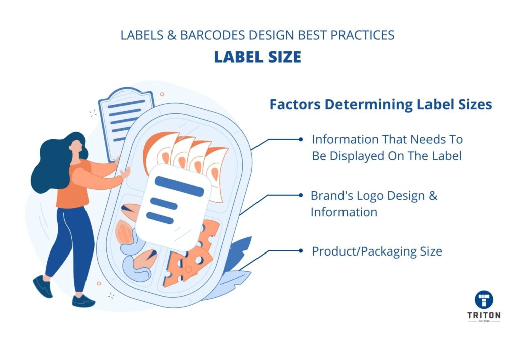
Once you have studied the labelling requirements of your industry, you need to decide on the size of the labels.
The right size of the label will depend on various factors, with the following being the most important ones:
Please note that some countries mandate specific label sizes based on the product category. Therefore, we recommend checking the country-specific label dimension requirements before starting the label and barcode design.
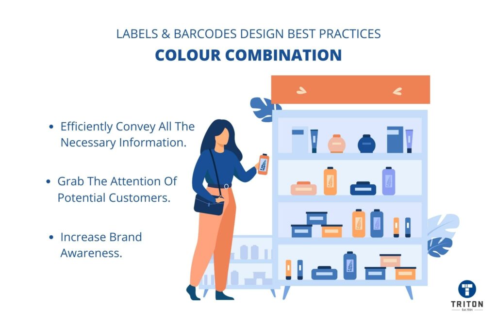
The colour scheme plays a significant role in the overall appeal of the label.
A simple yet attractive colour combination will ensure that your labels efficiently convey all the necessary information to customers. It also makes the product look appealing enough to grab the attention of potential customers and increase brand awareness.
You can also alter the barcode’s colour to match the style of their label design. However, keep in mind that the barcode colour should always be dark.
Traditional barcodes with blue or black strips on transparent or white backgrounds complement almost every design. If you want a change, dark green or brown are suitable alternatives. Please avoid using shades of red, orange, and yellow, (on parallel bars) as these colours are difficult for barcode scanners to read.
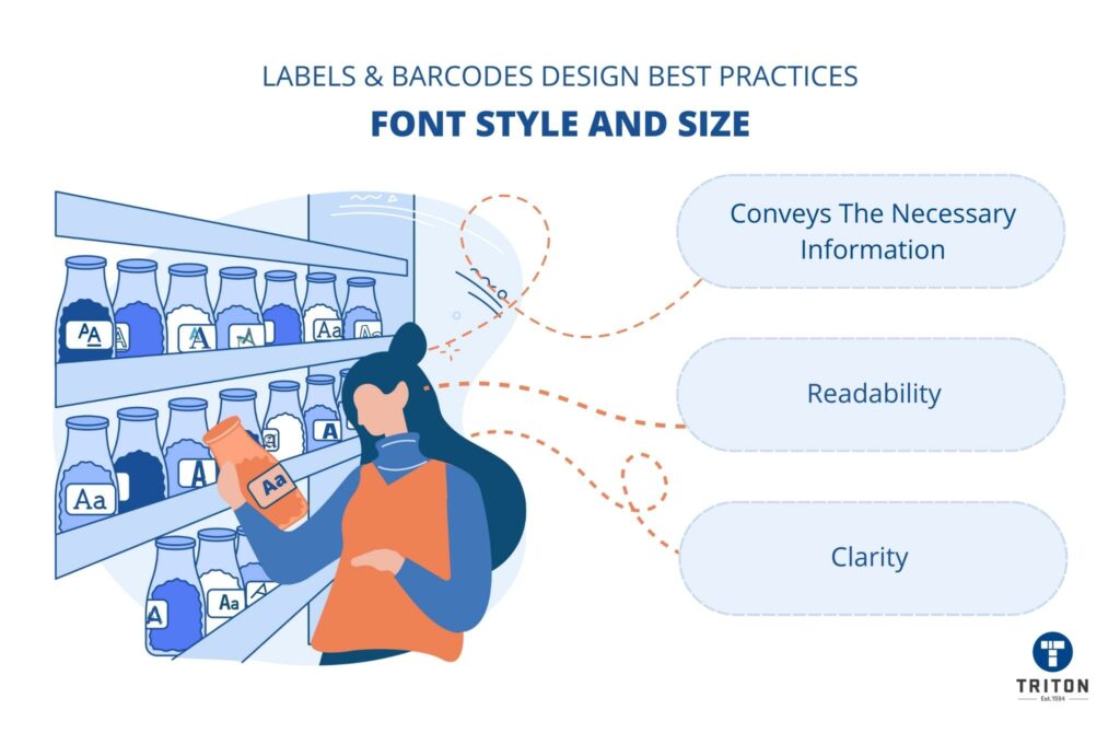
When choosing a font style and size for a label, your sole focus should be on achieving clarity and readability.
An aesthetically designed barcode is only helpful if it conveys the necessary information to potential customers. Therefore, make sure you choose a simple, legible font with generous spacing and size.
Barcodes also require special attention to font size.
Barcodes have numbers printed below the parallel lines. These numbers are human-readable interpretations of the encoded value of the barcode. So, if a barcode can not be scanned, the cashier can manually enter these numbers in the billing system, thus ensuring that customers get their products.
Therefore, the numbers below the bars should be large enough to be easily read by humans.
Tip – We recommend printing the whole label with the chosen font style and size to physically see how it looks before moving to the next step. You should also check the barcode for clarity and readability.
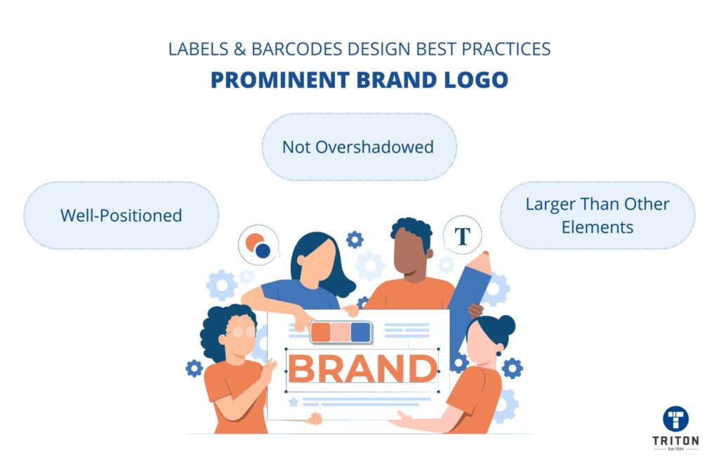
The brand logo is your identity and, therefore, should be the most prominent element of your product label. Brand logos not only helps customers identify the products but also plays a crucial role in boosting brand awareness.
When designing the barcode label, ensure the logo is well-positioned (central aligned recommended) and printed larger than all other information. Additionally, ensure that the logo is not overshadowed by the information and other images on the label.
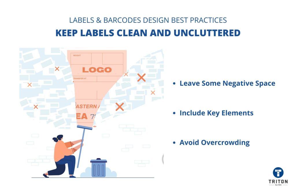
Avoid overcrowding your label with too much unnecessary information or design elements.
Keeping the labels clean and uncluttered is one of the best ways to ensure good readability, clarity, and aesthetic appeal. Make sure to leave some white space (also called “negative space”) to make the labels stand out.
Labels should only include key elements like the brand logo, name & description of the product, and the information as per the labelling regulations.
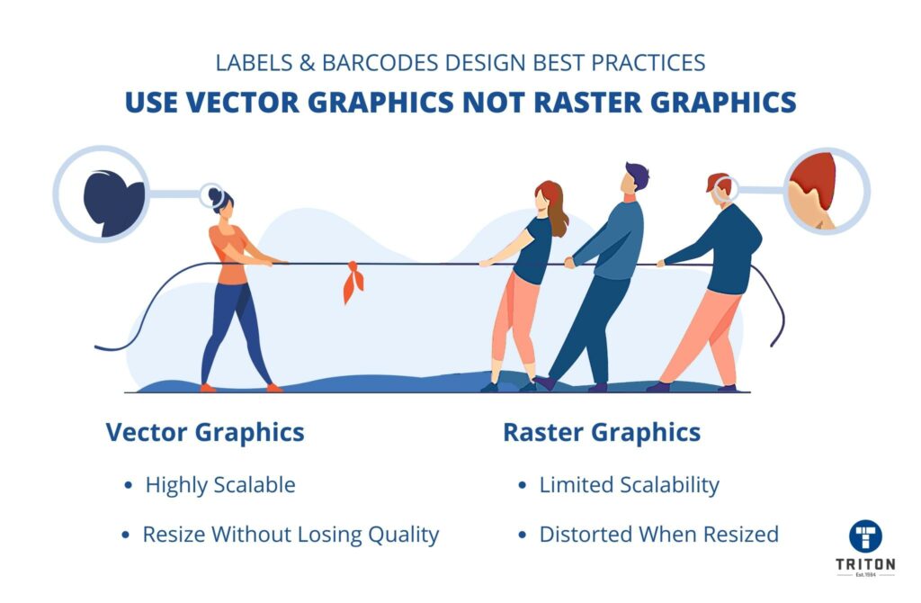
Vector and raster are two popular types of graphic formats.
Vector graphics use mathematical formulas and algorithms to generate lines, shapes, and curves with fixed points on a grid to create an image.
Raster graphics are made using small blocks of colour (called pixels) placed together on a grid to form an image.
Vector graphics are highly scalable, which means vector graphics can be recalibrated to any size without losing quality. This gives vector graphics a significant advantage over raster graphics, which get pixelated and distorted when resized.
By using vector graphics, you will never have to worry about image quality degradation, even if you need to print labels in different sizes.
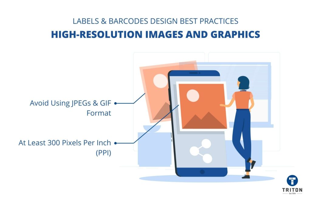
Using images and graphics is essential for improving the overall look and feel of the barcode label. However, it is important to use high-resolution images and graphics that are crisp and clear.
Ideally, you should use images and graphics of at least 300 pixels per inch (PPI). Avoid using JPEGs and GIF format images as they don’t print well.
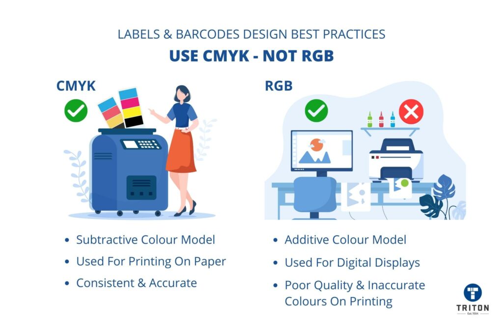
CMYK and RGB are two colour modes used in image editing software.
CMYK stands for cyan, magenta, yellow, and black (the four colours in a typical colour printer). It is a subtractive colour model that begins with white (paper) and lays down the different combinations of colour over the white. CMYK is primarily used for printing on paper.
RGB stands for red, green, and blue (the primary colours of light). It is an additive colour model that begins with black (darkness) and adds varying amounts of red, green, and blue lights to create different shades and hues. RGB is typically used for digital displays like computer monitors.
When designing barcode labels, it is always best to stick with CMYK colour mode. This is because barcodes will be printed using ink and a paper substrate, and CMYK will ensure that the colours on the labels are consistent and accurate.
On the other hand, if you design your label with RGB mode, the barcode will appear significantly different on a printed label than on a computer screen. Moreover, RGB images, when converted to CMYK, will cause colour shifts and distortion, resulting in poor quality and inaccurate colours.
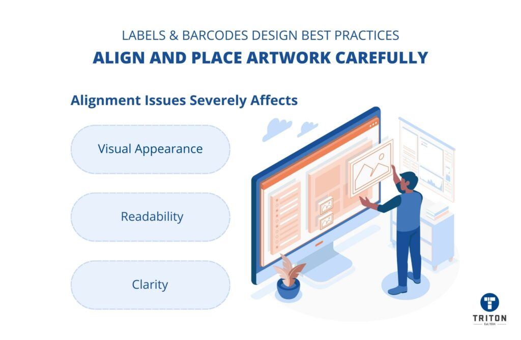
When designing barcode labels, the placement and alignment of artwork, images, texts, and other elements are very important. Guesswork or trial and error is not an option and will lead to alignment issues, severely affecting the readability, clarity, and visual appearance.
Label designing software feature alignment tools such as grids and rulers to help you align and place elements. Make sure to enable and use these tools to ensure proper alignment and placement.
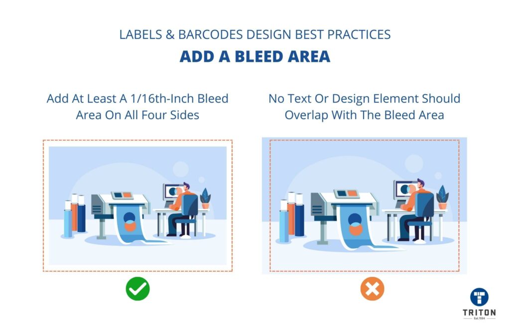
“Bleed area” refers to the margin space around the edges of a label design that gets trimmed off during the printing process.
Adding a bleed area ensures that no important text or graphics gets cut off during the label printing process.
Ideally, you should add at least a 1/16th-inch (0.0625-inch) bleed area on all four sides of a label before starting the label design process. You should also ensure that no text or design element overlaps with the bleed area.
Most pre-designed barcode labels have the correct bleed area set up. However, it is important to check this manually before designing barcode labels.
If you use text elements in your label design, it is best to convert them into outlines before finalizing and printing the design.
When text elements are converted into outlines, label design software treats them as objects instead of a font. This assures that there are no missing font errors or font substitutions when the image file is accessed in other image editing software or on a different computer.
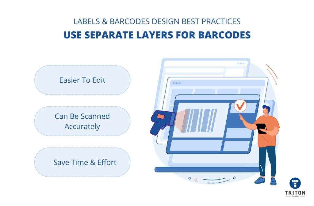
If you are adding barcodes on your labels, make sure to add them on a separate, individual layer (one that contains all barcodes) in your label design software. This will make it easier to edit and change barcodes without affecting the rest of the label design.
Moreover, placing all barcodes on a separate layer prevents the risk of obstructing the readability of the barcodes by other design elements and text on the label. This ensures that the barcodes can be scanned accurately, saving time and effort at point-of-sale.
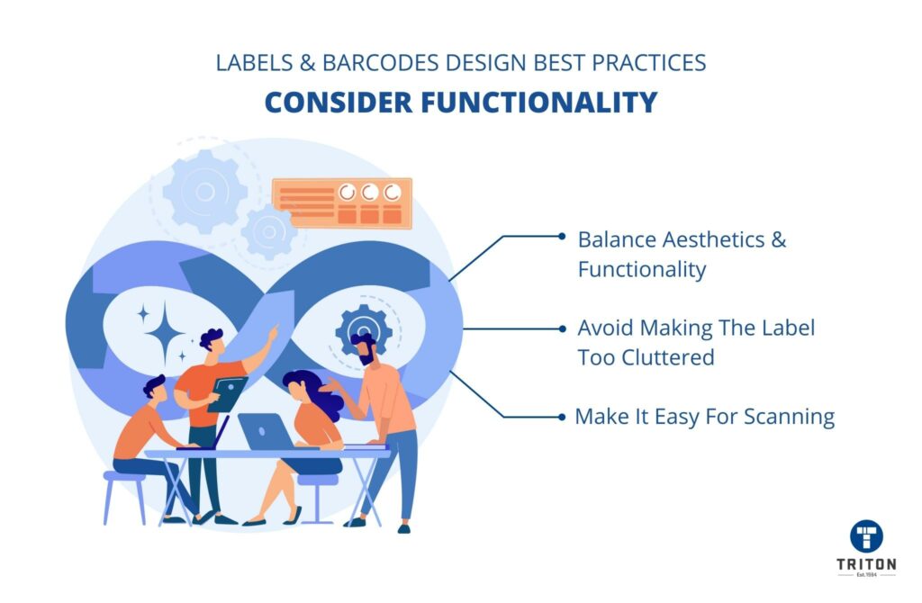
It’s tempting to get carried away by aesthetics and add fancy design elements to the label to make it look attractive. However, the sole purpose of barcode labels is to convey information and make it easy for scanners to read the data.
Therefore, while designing barcode labels, avoid getting too caught up in aesthetics that you lose sight of functionality. Avoid making the design too cluttered and complicated with too many text elements, images, colour gradients, etc.
Always try to strike a balance between aesthetics and functionality so that the label design looks good but also serves its intended purpose.
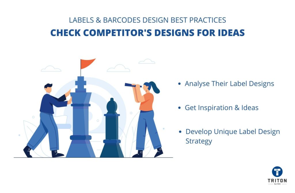
If you are new to designing barcode labels, it can be hard to know where to start. One of the best ways to get inspiration and ideas is by checking out what your competitors are doing in their label designs.
Look up your competitors’ labels and see how they use colour, text elements, images, and other design elements in their label designs. This will give you an idea of what works and what doesn’t so you can develop your unique barcode label design strategy.
Barcode and label designing can be tricky, but following the tips we’ve provided will help you create designs that are both functional and attractive.
So, to sum it up, there are a few key considerations that you should keep in mind when designing your labels. These include.
With a little bit of attention to detail and careful planning, you can create labels that will help your products stand out from the crowd. Just remember always to keep the needs and preferences of your target audience in mind, and you will be well on your way to designing the perfect barcode labels.
For all your thermal printing and label needs please contact the Triton team via the chat widget below!