Colour shapes behaviour and drives buying choices. Studies show that 62-90% of judgements rely on colour alone. Colour steers emotion, builds trust, and prompts action.
Label designers can use colour to guide shoppers’ views of a product and their actions. This guide shows how to apply colour theory to label design.
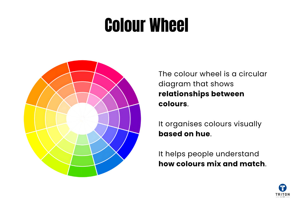
Colour has three components: hue, saturation and value. Each shapes how people see labels and decide.
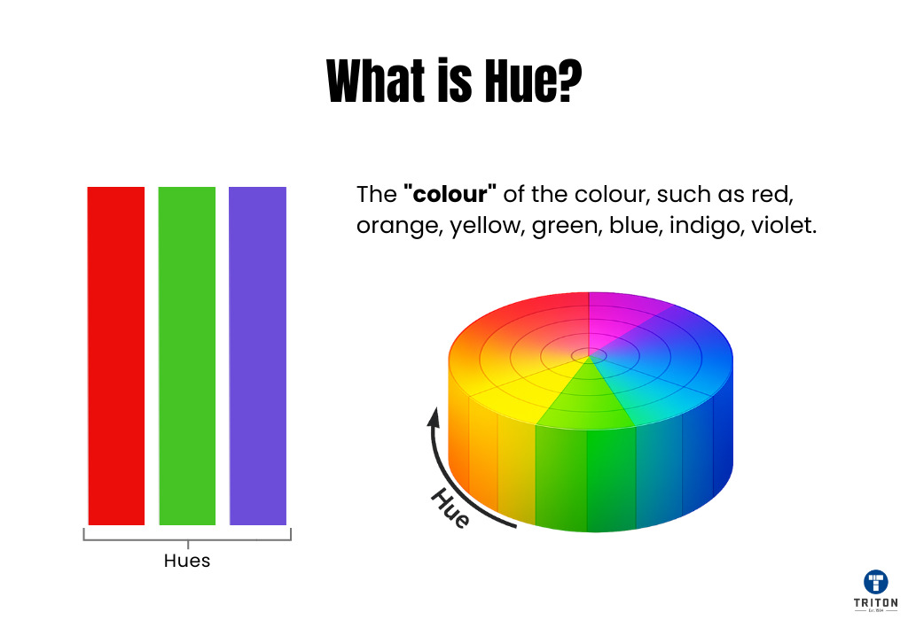
Hue is the property that lets us name a colour – red, orange, yellow, green, blue or purple. You can group hues into three sets:
Primary hues include red, yellow and blue. Secondary hues include green, orange and purple, which are made by mixing two primary hues. Tertiary hues are names like red-orange or blue-green, made by mixing a primary with a neighbouring secondary.
Hue sets the tone for your label. Each hue carries a meaning: red signals urgency, yellow signals caution, and blue signals trust. Pick the hue that matches your product’s message. Next, we cover saturation, which sets how vivid that hue appears.
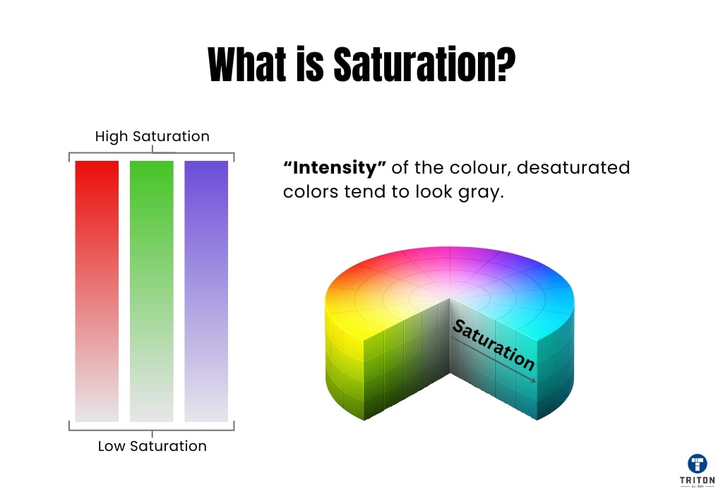
Saturation measures how much grey a hue contains. When you add grey to a hue, you create a tone.
A hue at high saturation stands out. A hue at low saturation recedes.
High saturation makes label elements stand out. Apply it to logos, brand names or warning marks. Low saturation pushes areas back. Apply it to backgrounds or blocks of text to aid clarity. Adjust saturation to guide the eye and set the reading order.
Next, we cover value, which sets how light or dark a colour appears.
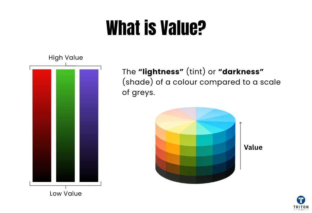
Value describes how light or dark a colour appears. You adjust value by mixing a hue with white to create a tint or with black to create a shade:
Tint: a hue plus white. Tints look softer and lighter. For example, adding white to red gives pink. Use tints on label backgrounds or accents for a gentle, inviting look without overwhelming other elements. Shade: a hue plus black. Shades look richer and darker. For example, adding black to blue gives navy. Use shades behind white or pale text to boost contrast and highlight key information, such as product names or critical warnings.
Layering tints and shades add depth and hierarchy to your label. A pale green tint can signal freshness in the background, while a deep green shade can anchor your logo or brand name.
Next, we explore colour schemes to learn how to blend hues, saturations and values on your label.
A colour scheme is a set of colours chosen to work well together. Think about how you might pick clothes that match – a colour scheme does something similar for design.
On a product label, designers use a colour scheme for a few important reasons:
Choosing the right colour scheme makes a label easy to read, looks good, and communicates what the product and brand are all about. Below, we look at six common schemes and how they can be used on labels. Refer to the figures as you read.
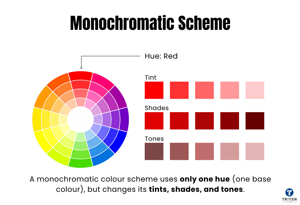
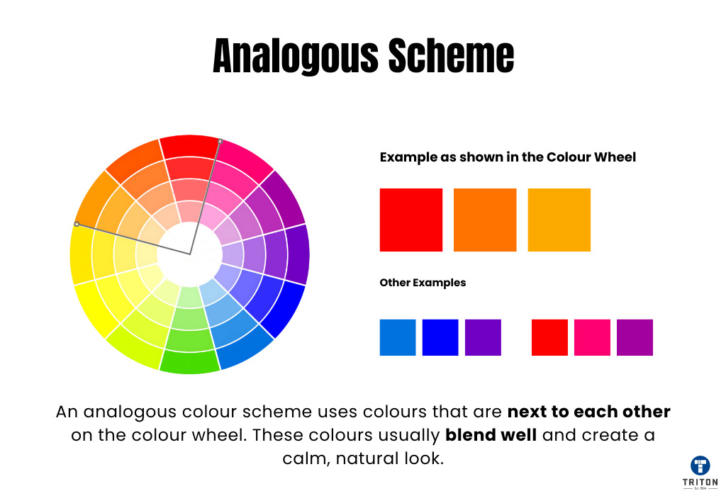
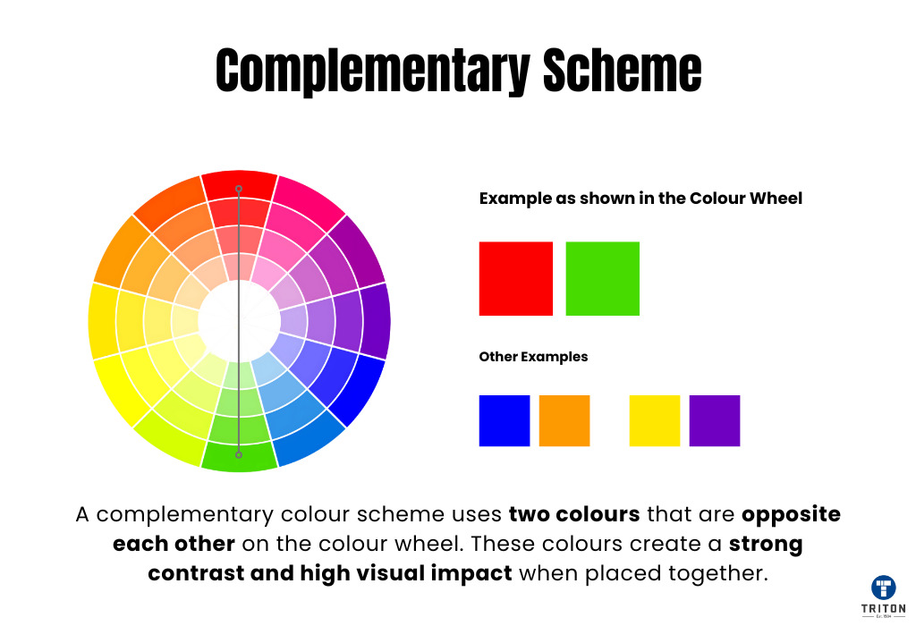
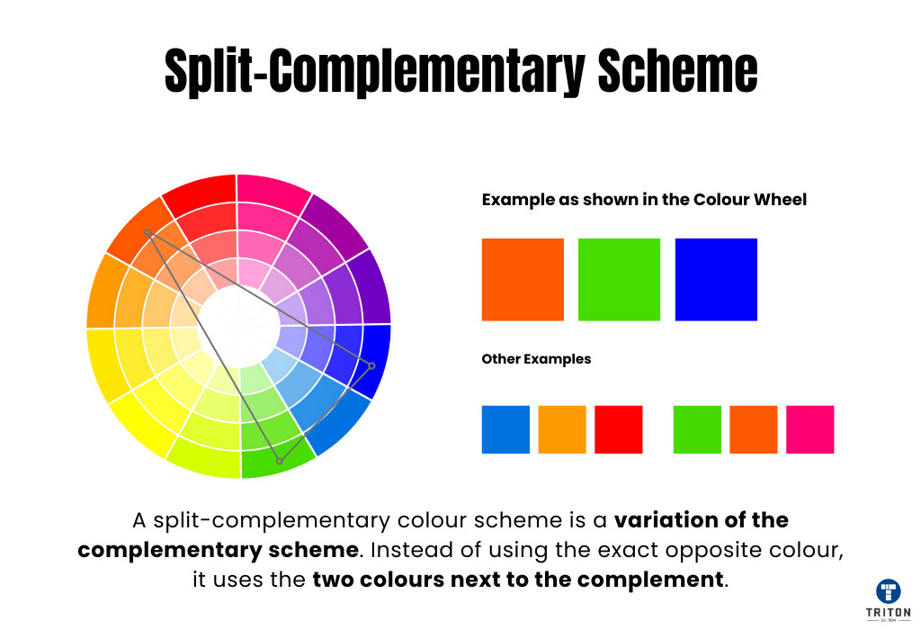
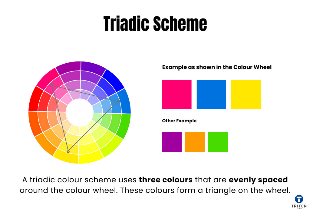
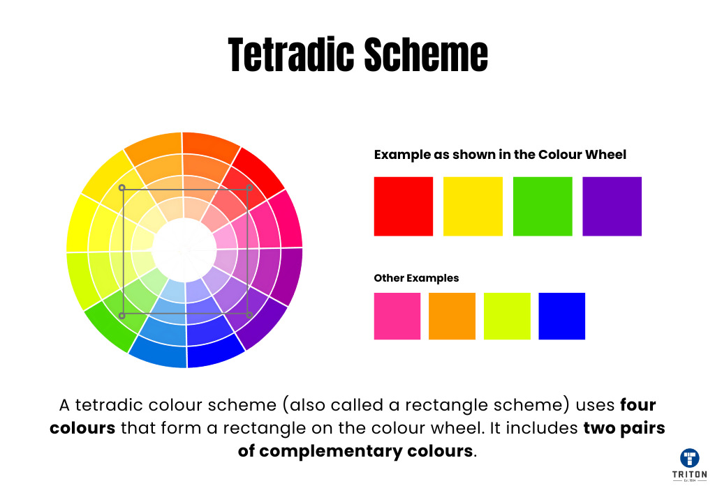
Why do we prefer certain colours over others?
It’s rarely just personal taste. Our colour preferences are often shaped by deeper factors like human evolution, personal experiences, cultural background, climate, and even education.
Understanding these influences helps label designers make better choices, considering how colours might be subconsciously perceived by different people viewing their products.
Science suggests our basic reactions to colours might be partly hardwired, linked to survival needs from our distant past.
Colours were vital clues for early humans navigating the natural world. Quickly Recognising colours could mean the difference between finding food and starving or spotting danger and staying safe.
Think about these potential deep-rooted links:
Why does this matter for label design?
While we don’t live like our ancestors, these ancient associations still subtly influence how we instinctively feel about colours.
A splash of red draws the eye, green implies naturalness, and blue suggests reliability.
Designers consider these potential underlying responses when choosing colours to communicate a specific message or feeling quickly on a label.
It’s not a strict rulebook, but an awareness of these possible primal connections adds another layer to understanding colour perception.
Beyond ancient instincts, our life experiences play a huge role in shaping our preferred colours.
This idea is captured by the Ecological Valence Theory (EVT).
Put simply, EVT suggests that we develop a liking for colours that we associate with positive experiences, objects, or feelings and a dislike for colours linked to negative ones.
It works like this: over time, the emotions you feel towards certain objects or experiences transfers to the colours associated with them. This process is largely unconscious and is always at work, even while you are reading this article.
Consider these examples:
Why does this matter for label design?
Because EVT shows colour preference is not purely evolutionary but also learned and personal, designers know reactions vary greatly between people.
No single colour guarantees universal appeal. This subjective nature makes understanding your specific target audience crucial. Shared positive or negative associations within that group will strongly influence which colours prove most effective for your label in their eyes.
Education plays a role in shaping our responses to colour, although basic preferences – like the widespread liking for blue, confirmed in studies – often cut across all backgrounds.
However, research links formal art and design education with a developed appreciation for colour nuance, theory, and complexity, as these are explicitly taught.
It’s harder to find clear links between general education level and how people see colour. However, some research suggests that people with more education are often exposed to a wider variety of art and design, which might make them more used to different or complex colour combinations, not just the basic primary colours.
What people consider good taste, including the colour combinations they like (muted/complex vs. bright/simple), is often associated with specific social groups. Education level is usually one factor these groups have in common.
This means people’s backgrounds and what they’re used to seeing, partly shaped by education, affect how they react to complex or subtle colour choices.
The main point from the research is clear for label designers: when choosing colours, think about how visually experienced your target audience will likely be.
The prevailing climate shapes colour preferences as people subconsciously seek colours that offer psychological comfort or contrast to their everyday environment.
Consider these tendencies:
This potential influence is less impactful than cultural meanings or personal experiences.
However, it could be a minor, secondary consideration when designing specifically for markets located in extreme climates.
For example, cool, watery blues enhance the refreshing appeal of a drink sold in a tropical country, while warm, rich tones make a product seem more comforting or inviting in a frigid region.
But remember, these are just potential slight biases; your brand identity, product type, and specific cultural colour associations in that market will almost always be more important factors in your colour decisions.
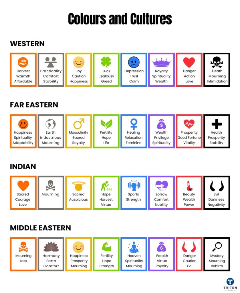
Stop thinking about colour meaning as fixed.
While basic physiological responses to colour exist, specific symbolic meanings are overwhelmingly learned through cultural context.
Foundational research, such as Berlin and Kay’s (1969) study of basic colour terms, highlighted how even the way colours are categorised varies across cultures.
Deeply ingrained associations mean a single colour signifies opposing concepts—purity or death, luck or danger—depending entirely on society. Effective label design must account for this learned variability. Refer to the following table for documented examples of these divergent cultural interpretations.
Colour | Meaning | Cultural Variations | Example | How to Use in Labels |
|---|---|---|---|---|
Red | Excitement, danger, love, and passion. | Western cultures: Excitement and love. India: Purity. China: Luck and happiness. Middle East: Danger. Eastern Bloc: Communism. | Coca-Cola (excitement and passion).
| Use red to draw immediate attention, signal urgency, or highlight important details (e.g., “Sale” or warning labels). |
Blue | Trust, safety, authority, and calmness. | Western cultures: Trust and safety. Eastern cultures: Spirituality and immortality. Latin America: Religion or mourning. | IBM (trust and reliability).
| Blue conveys trust and professionalism. Ideal for health products, tech items, or secure services, creating a calming visual.
|
Green | Nature, progress, growth, and luck. | Western cultures: Nature and luck. Indonesia/China: Infidelity. Mexico: Patriotism. Islam: Religious ties. | Starbucks (nature and freshness).
| Use green for eco-friendly, organic, or natural products to promote freshness and sustainability, especially for eco-labels. |
Orange | Warmth, enthusiasm, and energy. | Western cultures: Warmth and autumn. Middle East: Mourning. India: Sacred. Japan: Love and courage. | Fanta (energy and fun). | Orange adds energy and enthusiasm, effective for call-to-action labels or products aimed at younger, dynamic audiences. |
Black/Brown | Durability, density, and importance. | Black: Elegance, power (Western), mourning (other cultures). Brown: Stability, reliability. | UPS (reliability and strength).
| Use black for luxury items and brown for products emphasizing durability and strength, creating a sense of importance. |
White | Cleanliness, purity, and simplicity. | Western cultures: Purity and simplicity. Eastern cultures: Death and mourning. | Apple (simplicity and elegance).
| Ideal for minimalist labels, white is used for medical, tech, or hygiene products to convey cleanliness and purity. |
Yellow | Optimism, warmth, and caution. | Western cultures: Happiness and caution. Asian cultures: Royalty and power. | McDonald’s (warmth and optimism).
| Use yellow to highlight important information, like warnings or sale items, as it’s eye-catching and conveys optimism. |
Purple | Royalty, luxury, and spirituality. | Western cultures: Wealth and royalty. Thailand: Mourning. Egypt: Virtue and faith. | Cadbury (luxury and indulgence).
| Purple adds a touch of luxury and sophistication, ideal for premium brands, beauty products, or indulgent goods. |
Pink | Compassion, love, and femininity. | Western cultures: Femininity and romance. Japan: Youth and good health. | Barbie (femininity and fun). | Pink is great for products targeting a feminine audience, creating a sense of fun, compassion, or youthful energy.
|
Grey | Neutrality, formality, and professionalism. | Western cultures: Sophistication and formality. Eastern cultures: Modesty. | Apple (professionalism and tech).
| Grey is used for high-tech, modern products, creating a sense of balance, professionalism, and formality.
|
While colour theory and psychology are foundational, applying the knowledge you gained to create functional, compliant, and appealing labels requires addressing the following practical points.
Labels exist to communicate. Sufficient colour contrast between text (especially small print like ingredients or instructions) and its background is non-negotiable for legibility.
Applying your chosen colour scheme for effective labels requires balance to create a visual hierarchy and avoid overwhelming the viewer.
A common starting point is the 60-30-10 rule. Allocate roughly 60% of the space to your dominant colour (often the background or main field), 30% to a secondary colour (supporting elements, subheadings), and 10% to an accent colour (calls to action, highlights, key details). This rule of thumb helps distribute visual weight effectively.
Colour appearance changes based on the physical label substrate and finish. What you see on screen (RGB) will differ from the printed output (CMYK), and the material adds another variable.
Theoretical choices and on-screen previews are insufficient, and don’t substitute real-world testing.
Labels must align with the overall brand identity.
This section introduces some key practical aspects of applying colour theory to labels. Designing and printing labels requires deeper knowledge of specific print methods, material science, ethics, regulation, and compliance.
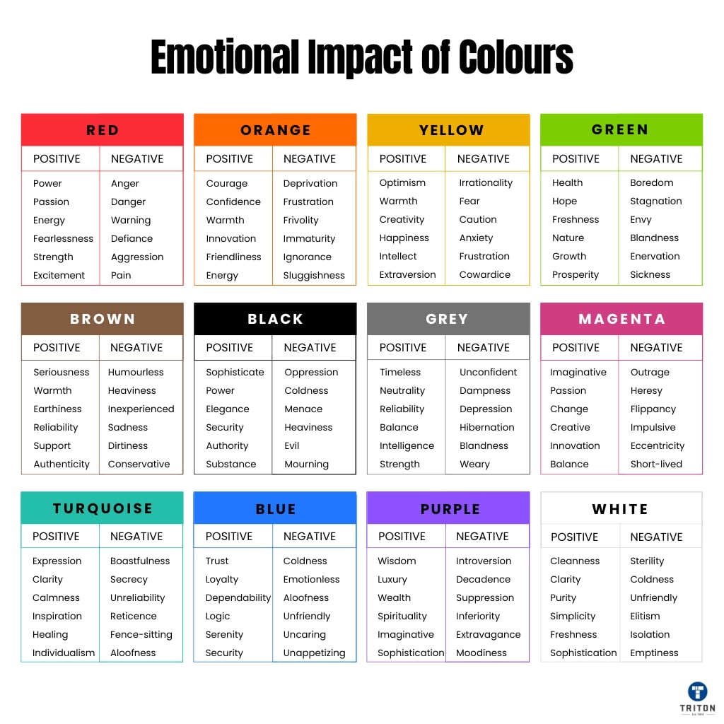
Colour on a label is far more than decoration; it influences perceptions, emotions, and purchasing decisions.
This guide has covered the essential building blocks of using colour in labels: understanding hue, saturation, & value, leveraging effective colour schemes, acknowledging the psychological factors from evolution to cultural context, and practical considerations like readability and production.
With this knowledge, you can move from subjective preferences towards strategic colour choices your target audience would love and would align with your brand’s goals.
When you’re ready to bring your carefully crafted, colour-conscious designs to life and ensure they look as impactful in print as on-screen, explore professional label printing solutions. For dependable results honouring your design intent, consider checking out the options available at the Triton Store. Remember, a well-designed label with quality printing can make all the difference on a competitive shelf.